Where Has the Brand’s Soul Gone?
Reflections on convergence, memory, and the fading distinctiveness in modern branding
Reason Praxis | Make Sense in Marketing
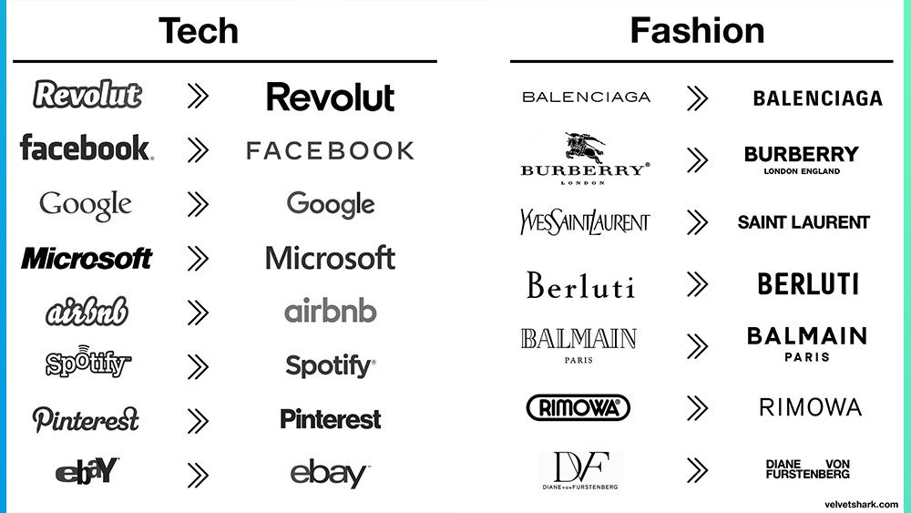
At Reason Praxis, we pay close attention to the gravitational pull of market-wide shifts, especially when they echo across sectors, geographies, and platforms. The current wave of brand simplification is one such case. It’s reassuring, even affirming, to see others recognising the same pattern: a growing convergence in logo design that has transformed identity into a question of font weight and kerning. Yes, simplicity has its merits. Evolution is part of any living system. But the speed and uniformity of this shift raise a deeper concern:
Where has the Brand’s soul gone?
An interesting trend, especially in an era dominated by calls for diversity, authenticity, and customer-centred design. At precisely the moment brands claim to be listening more closely to unique audiences, their visual language is growing less expressive, less differentiated, and, ironically, less human.
The move toward minimalism has not only streamlined logos but also stripped away the richness once found in graphic design, artistic symbolism, and cultural reference. Increasingly, we see companies reducing their visual identity to little more than letters, thinly differentiated by typeface alone.
For now, this strategy may ride on the power of collective memory. Familiar names, once introduced with bold graphic expression, can survive being flattened, temporarily. But memory fades. And minimalism, by its nature, does not renew energy; it conserves it.
This is where we choose not to follow. Not out of nostalgia, but from a belief that enduring brands require more than legibility. They require character, narrative, and distinctiveness. This is the golden rule of Marketing.
Nature is not minimalist. Why should branding be?
Take the example of nature: it is anything but minimalist. Yet it rarely feels chaotic.
A tree’s branching is complex, but structured. A seashell’s spiral is not simple, but ordered. A forest is full of overlapping forms, textures, and patterns, yet it remains coherent, immersive, and calming. These are examples of living complexity, not flat clarity.
Nature’s beauty emerges from structured intricacy, not from the absence of detail. The same applies to meaningful design.
The human brain evolved in complex, irregular, and multi-sensory environments. We are wired to respond to layered forms, fractals, texture, and rhythm, not sterile reduction.
This matters for branding: over-simplified logos can quickly become abstracted to the point of losing meaning, resonance, or memorability. Just as plastic leaves cannot replace a tree, a sterile logotype cannot replace the layered identity of a living brand.
An interesting trend, especially in an era dominated by calls for diversity, authenticity, and customer-centred design. At precisely the moment brands claim to be listening more closely to unique audiences, their visual language is growing less expressive, less differentiated, and, ironically, less human.
The four lures behind design convergence
- Digital Adaptability
In an era where logos must scale across devices, from smartwatches to browser favicons, complexity becomes a liability. Clean, minimal forms survive the compression and shrinking of modern display contexts. The demand for visual performance drives simplification regardless of sector or style. - Psychological Efficiency
According to claimed ‘research’ broadly used across the digital design environment, the human brain would prefer ‘simplicity’ – up to a point. Gestalt principles and cognitive fluency research seem to show that we would trust what we can process quickly. Logos that use geometric forms, sans-serif fonts, and symmetrical structures are easier to decode, but that does not mean they are always meaningful. - Consistency at Global Scale
Minimalist branding allows for seamless consistency across geographies and platforms. A single design language can work from Shanghai to São Paulo without adaptation. But this also means shedding local nuance and expressive detail in favour of global legibility. - Convergence, Not Coincidence
The similarity in modern logos is not accidental. It’s the product of shared design constraints—and shared templates. Branding is increasingly routed through the same handful of agencies, type foundries, and style guides. The result is aesthetic monoculture: distinct names, indistinct looks.
A tale of two skylines: St Paul’s Cathedral vs the Shard
Symbolic richness vs flattened utility
Minimalist aesthetics now dominate more than branding. Cities, too, have followed the trend. Take two London icons: St Paul’s Cathedral and The Shard.
St Paul’s, with its layered ornament, symmetrical curves, and dome geometry, expresses a sense of order, sacred proportion, and civic symbolism. It feels both anchored and aspirational, complex, but harmonious.
By contrast, The Shard, while praised for its engineering, reflects a kind of sharp-edged abstraction: angular, jagged, and opaque in meaning. Its minimal materials belie its visual chaos.
St Paul’s feels like a tree: rich in detail, growing from foundations of meaning.
The Shard feels like a shard of glass: disconnected, jarring, and emotionally remote.
This comparison captures the essence of the minimalist design dilemma. It’s not about old vs new. It’s about coherence vs abstraction.
What minimalism forgets
This convergence may succeed in the short term by riding on established reputations. But minimalism alone cannot generate fresh memory. It does not surprise, provoke, or delight. It is legible, not memorable.
Brand identities are not sustained by recognition alone. They endure through the stories they suggest, the emotions they evoke, and the symbols they carry forward. Typography can convey tone, but not mythology.
Simplicity is not everything.
We don’t reject simplification or minimalism. But we reject erasure masquerading as clarity, or design and even art. The best branding distills meaning without draining it of life.
In a market of visual sameness, difference becomes the most valuable asset. Not noise, not clutter, but depth, richness, and soul. That is the kind of design we remember, and the kind of presence we build.
Thank you for your time and interest.
Please join us by subscribing to our Blog. Posts are occasional and written as thoughts come.
Please leave your comment at the bottom of this page to continue the reflection on this post.
If you are looking for a reliable, independent professional consultancy to assist you in getting through the mist and the storm and cutting through an often artificial complexity, please do get in touch with us for an informal discussion, or write to contact @ reasonmakesense .com (please remove spaces)
Get in touch to discuss freely; reason will Make Sense, with you and for you.
A few words about Reason
reason supports Shareholders, Board, C-Suite Executives and Senior Management Team in achieving Business Excellence and Sustainability through our Praxis unique approach.
We Make Sense with you and for you.
We work and think with integrity, are independent and fed by a very broad spectrum of robust information sources, which is certainly one of the rarest and best qualities a consultancy can offer demanding decision-makers willing to overcome challenges and reach impactful, tangible and measurable Business Excellence.
We follow reason, facts, best practices, common sense and proper scientific approaches. This is our definition of professionalism. It brings reliability, confidence and peace of mind.
Please check our offering, subscribe directly on this page, write to contact @ reasonmakesense .com (without the spaces) or click on our logo below to get redirected to our contact form.
Thank you for reading!
Reason Praxis | Make Sense
Excellence & Sustainability
www.reasonmakesense.com
There is nothing wrong in doing things right, first time.
Share this post

#Marketing #Branding #Semiotics #Graphic Design #Identity #Diversity #Business